Exercise 2: Packing

For this assignment I was assigned to create an Ice Cream line created by Harry Styles. Harry Styles is known for his whimsical brand and creative marketing. This project helped me dive deep into both the history of Harry Styles and the History of ice cream.


Whats ice cream?
Before diving into the assignment, I wanted to have a good understanding on what type of ice cream I wanted to promote but also the history of ice cream. I looked up three successful but different brands and learned more about their origin story. I liked Haagen Dazs since they're more of a foreign successful brand. Cream is more local to the Bay Area as it was created in Berkeley and are famously known for their ice cream sandwiches. Lastly Ben & Jerry's is the definition of success as they are very well known and have been able to brand themselves with their unique flavors. With this I wanted to combine the three for this assignment, fun flavors with a good origin story and a whimsical name.


Whos Harry Styles?
Harry Styles is a pop star but also a previous member of the infamous boy band
One Direction. Harry Style is from the UK and with this I wanted to incorporate this in some sort of way. Harry is known for his whimsical personality and creative marketing tactics. I focused more on his album 'fine line' as it is this colorful album with unique song titles. Harry Styles has various fruit named song titles like Kiwi, Cherry & Watermelon Sugar. His aesthetic and personality overall embodies funky and whimsical.
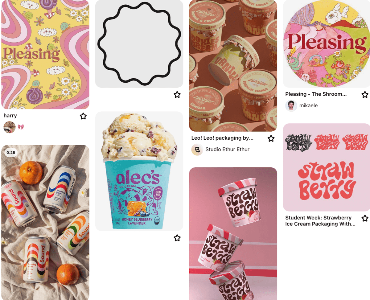
Inspiration
I took inspiration from Pinterest as I wanted to find unique fonts, packaging and brands thats would inspire this Harry Styles ice cream. With this I found different packing styles and colors that would compliment each other. I also looked into Harry Styles own personal brand as he has his own line of nail polish and other self care titled 'Pleasing'


Brand Personality
for this brand extension of ice cream I wanted the brand to be whimsical and follow Harrys brand overall. I wanted the brand to be very colorful like Harrys Pleasing brand. I also wanted to continue the watermelon sugar excitement with the vintage feel and summer feel.


Colors and flavors
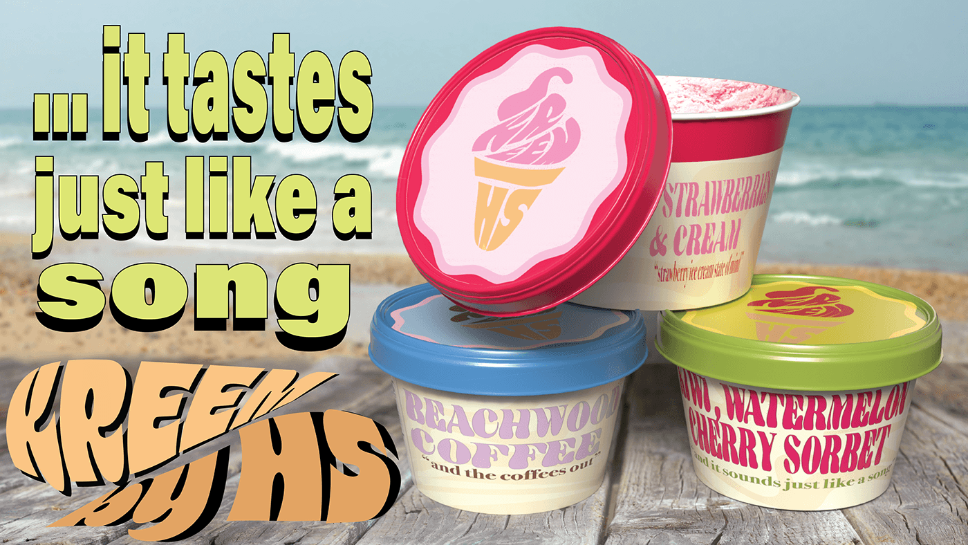
For colors I wanted to stick to Harry Styles Pleasing colors and really chose colors from this brand. With this I also created the ice cream menu as I wanted the flavors to really embody the brand. Strawberries & Cream is the first flavor with the slogan "strawberry ice cream state of mind". This was from his hit song 'adore you' and overall these flavor combination matched his personality and aesthetic. Beachwood coffee is inspired by. Harrys favorite coffee shop in Malibu which he also has sang about in his song 'Falling' with the slogan and the coffees out. Lastly a cherry, watermelon, kiwi sorbet inspired by his fruit inspired songs with the slogan and it sounds just like it a song from his hit song 'watermelon sugar'. With these song choices I narrowed down my color scheme and really created my color code for the flavors.


KREEM
The name had to have some kind of 'kink' to it as that is very much Harrys marketing tactics as he has 'pleasing' by HS and having a name have multiple meanings to it makes most sense for the artist. Originally I had came up with CREAM but it is a mock of the shop in Berkley therefore I wanted come up with something similar. I the UK ice cream is pronounced more like KREME, and thats when 'KREEM' by HS was created. With the logo I wanted to have some shape to the typography. The final sketch is attempting to resemble an ice cream sandwich.


The sketch and design
for the packing I wanted to have the logo on the lid mimicking a shape of an ice cream sandwich. Having the lid and body match and overall continue with the colorful and whimsical brand.


The logo
The logo is in shape of an ice cream cone with the "Kreem" being the soft serve and the 'HS' being the cone. This came from once again this whimsical personality. The ice cream also previews the ice cream as it follows the flavors of strawberries and cream, coffee and a fruity sorbet.


The label
The label is suppose to compliment the lids but also have the text stand out. Switching the color to a creme color gave it the body text a pop since it stands out more with this. Also putting the slogans on the ice cream tubes helped emphasize who the ice cream was created by.

3D Model
For the models I didn't want anything too complicated since I knew I realistically only wanted to create a tub of ice cream or a pint so I went with the pint since I found them more aesthetically pleasing.


3D and Placement
For the placements I really played around with various placements. I know I wanted the lid to stand out from one as it shows the logo. Also choosing the background, I wanted it to have this summer feel since ice cream is definitely a beach thing.


The Promo
for the promo I analyzed Harrys previous promos and realized that it resembled Watermelon Sugar. I took a more vintage approach to the promo and followed his brand personality. This resembles a unique ice cream promo that Harry Styles would definitely support.